Plots
Categories:
Most plots visible in the ClusterCockpit webinterface are implemented via uPlot or Chart.js, which both offer various functionality to the user.
Metric Plots
The main plot component of ClusterCockpit renders the metric values retrieved from the systems in a time dependent manner.
Interactivity
A selector crosshair is shown when hovering over the rendered data, data points corresponding to the legend are highlighted.
It is possible to zoom in by dragging a selection square with your mouse. Double-Clicking into the plot will reset the zoom.
normal metric threshold at first, i.e. the threshold will either be the highest rendered value (spaced line), or will be used to cut-off outliers (10 x normal threshold). Resetting by double-clicking will re-render the plot with regard to the highest value of the dataset, i.e. adapt the Y-axis to match said maximum value.Resampling of Data
If “Resampling” of metric plots is enabled in the configuration file (config.json), data is primarily loaded on the coarsest resolution. Zooming into the dataset, as described above, will continuously trigger a reload of the data in finer resolutions, until the highest resolution is reached. A finer resolution is requested from the backend as soon as the number of visible data points falls below a configured amount (“Trigger”).
Please note: While archived data is read from disk, and therefore can be resampled in the backend directly, resampling of data for running jobs requires the use of a matching version of CC-Metric-Store.
Running Job metric data read from older versions of CCMS will still return correctly, but will always return in the metrics configured timestep.
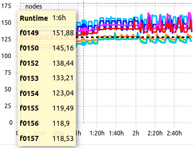
Conditional Legends
Hovering over the rendered data will display a legend as hovering box colored in yellow. Depending on the amount of data shown, this legend will render differently:
- Single Dataset: Runtime and Dataset Identifier Only
- 2 to 6 Datasets: Runtime, Line Color and Dataset Identifier
- 7 to 12 Datasets: Runtime and Dataset Identifier Only
- More than 12 Datasets: No Legend
- Statistics Datasets: Runtime and Dataset Identifier Only (See below)
The “no legend” case is required to not clutter the display in case of high data volume, e.g. core granularity data for more than 128 cores, which would result in 128 legend entries, possibly blocking the plotting area of metric graphs below.
Example
Eight datasets result in an average value within expected parameters, the background remains white. The legend displays each allocated hostname as dataset identifier.
Colored Backgrounds
The plots’ background is colored depending the average value of the viewed metric in respect to its configured threshold values. The three cases are
- White: Metric average within expected parameters. No performance impact.
- Yellow: Metric average below expected parameters, but not yet critical. Possible performace impact.
- Red: Metric average unexpectedly low. Indicator for suboptimal usage of resources. Performance impact to be expected.
Example
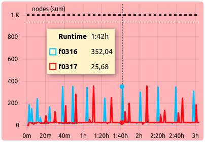
Two datasets result in an average value of less than the configured ‘alert’ threshold: The legend displays both identifiers with their respective color, while the background is colored in red to indicate suboptimal metric performance.
Statistics Variant
In the job list views, high amounts of data are by default rendered as a statistical representation of the numerous, single datasets:
- Maximum: The maximum values of the base datasets of each point in time, over time. Colored in green.
- Median: The median values of the base datasets of each point in time, over time. Colored in black.
- Minimum: The minimal values of the base datasets of each point in time, over time. Colored in red.
Example
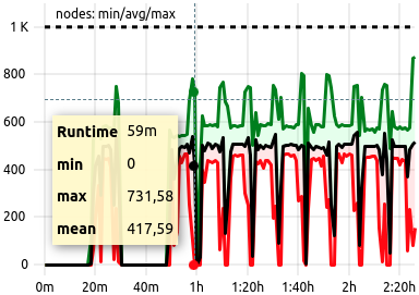
A job with a high count of allocated nodes, running well within expected metric parameters. Since, by definition, the colors for this statistical render are always identical, only the runtime and the statistic datasets’ identifiers are shown.
Histograms
Histograms display (binned) data allowing distributions of the repective data source to be visualized. Data highlighting, zooming, and resetting the zoom work as described for metric plots.
Example
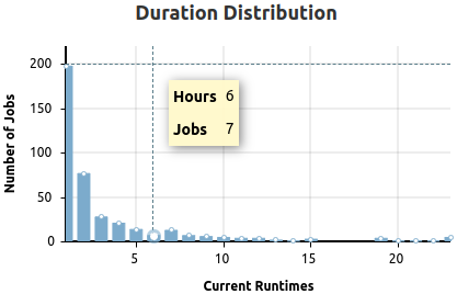
Duration distribution of selected jobs. The legends will display the X-Axis value label first, then the Y-Axis value label. The legend is shown for each bar individually when hovering the selection crosshair over the inspected bar. A highlight will show as white dot at the top.
Roofline Plot
A roofline plot, or roofline model, represents the utilization of available resources as the relation between computation and memory usage.
Bubble Roofline
The roofline models shown in the status dashboard views are rendered as bubble scatterplots. Utilization data represents either the job-average or the node-average of the last 5 minutes of sampled data, i.e running jobs or reported node metrics.
Additional information is rendered by color and size of the bubbles, depending on the data source:
| Type | Color | Size |
|---|---|---|
| Node Roofline | The current scheduler state of the node. | The current number of parallel jobs currently running on the node. |
| Job Roofline | The current job duration. | The amount of resources used by the job (Number of allocated nodes OR number of allocated accelerators). |
Clicking on a bubble will open a new tab with either the respective jobs’ detail view, or the respective nodes’ metric overview.
Example
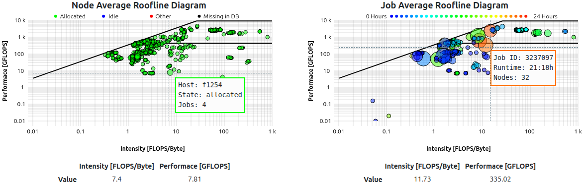
Roofline models as shown for a subcluster. Legend on hover displays additional information as written text.
Scatter Roofline
The roofline model shown in the job detail view is rendered as dotted scatterplot. It renders every sampled utilization data point colored by time.
Example
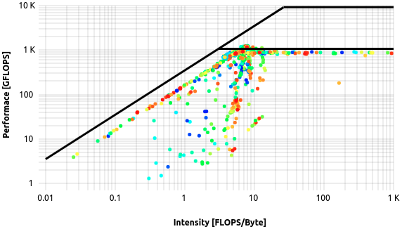
Roofline model as shown for a single job. Time information is encoded in the color range, starting from blue dots and ending in red dots.
Heatmap Roofline
The roofline model shown in the analysis view is rendered as a heatmap. This is due to the data being displayed is derived from a number of jobs greater than one, since the analysis view returns all jobs matching the selected filters. The roofline therefore colors regions of accumulated activity in increasing shades of red, depicting the regions below the roofs in which the returned jobs primarily perform.
Example
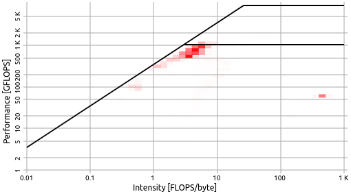
In this example, the selected jobs perform in near optimal, as depicted by increased job activity right below the first ‘knee’ of the roofline model.
Double Metric Plot
Variant of the default metric plot rendering data on Y1 and Y2 axes over time. Currently only used in status dashboards to display cluster-wide memory bandwidth and flops per second sums, scaled to Tera (1012), as a measure of cluster utilization.
Example
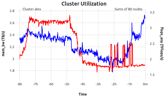
mem_bw (blue) and flops_any (red) metrics as time-dependent sums over all nodes of cluster alex. In this example, the data is shown for the last 8 hours of 80 nodes.
Stacked State Plot
For indicating the development of reported cluster scheduler node states, or metric health states, a stacked representation of the counts over time is used. The sum of all timeseries Y-values is representative of the total sum of reporting nodes.
| Color | Green | Yellow | Red | Blue | Magenta | Black |
|---|---|---|---|---|---|---|
| Scheduler States | Allocated | Mixed | Down | Idle | Reserved | Unknown |
| Health States | Full | Partial | Failed | - | - | - |
Example
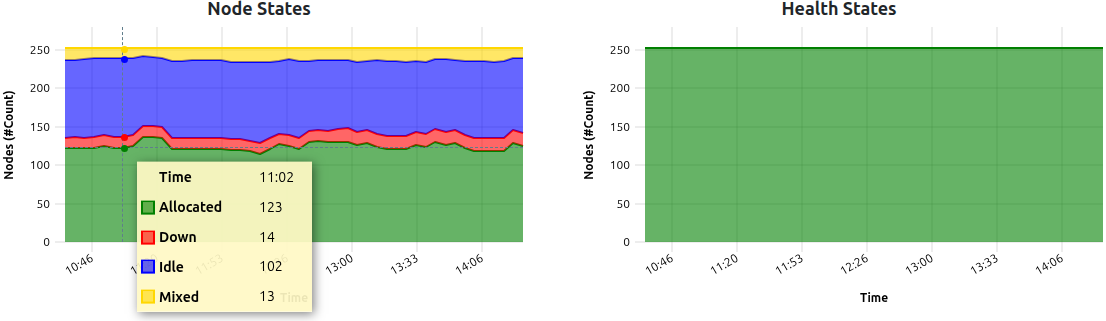
In this example, a total of 250 nodes reported their respective state information for the last four hours. ‘Node States’ report minor fluctuations of four states currently present within the cluster. ‘Health States’ report optimal quality of the transmitted metrics during an identical timeframe.
Pie Charts
Current distributions of, for example, top usage information for clusters, or the latest state of node health (see above), will be rendered using classic pie chart representation. Pie charts in ClusterCockpit are always accompanied by a color legend as well as a table representation of the data. Entities such as users or projects are always linked and will lead to the respective view in a new tab.
Example
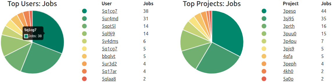
Pie charts representing top usage by job count for single users and project groups, respectively (Name scrambling is active). Color scheme of pie charts will change if color blind mode is enabled.
Polar Plots
A polar, or radar, plot represents the utilization of key metrics. Both the maximum and the average utilization as a fraction of the 100% theoretical maximum (labelled as 1.0) are rendered on a number of axes equal to the displayed key metrics. This leads to an increasing area, which in return marks increasingly optimal resource usage. In principle, this is a graphic representation of data also shown in the footprint component.
By clicking on one of the two legends, the respective dataset will be hidden. This can be useful if high overlap reduces visibility.
Example
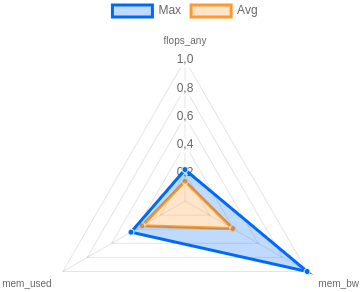
In this example, the selected job performs quite well, as depicted in the acceptable and equally distributed usage of core metrics. On average, all three metrics are utilized at about 20% (0.2) of the configured hardware maximum. At a point in time, the maximum even reached close to 100% (1.0) of the memory bandwidth (mem_bw).
Comparogram
A special plot coined “Comparogram” to display information about multiple jobs, sorted by start_time-timestamp, for comparison purposes.
Used in the “Job Compare”-functionality, the top plot always shows the allocated resources of the compared jobs in a semi-logarithmic manner, with X the JobID and Y the resource count. Three types of resources are rendered, if found: Nodes (Black line, always at least with a value of 1), Threads (Blue line, always at least with a value of 1), and Accelerators (Red line, can be 0).
The resource compare plot is always accompanied by (at least) one metric comparison plot. For the selected metric, the job statistics calculated over the full runtime of the respective job are rendered, and plotted according to job start timestamp.
To make localization of interesting artifacts easier, the pointer is synchronized between all rendered compare plots in the compare view.
Example
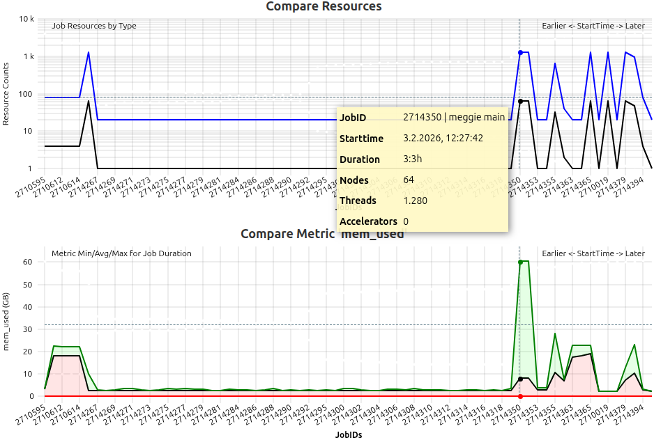
Example of compare plot usage. Top plot shows resource usage of jobs running on a CPU-Only cluster, with additional information in the legend per hovered job. The second plot shows the mem_used metric statistics for each compared job with an easily recognizable peak, probably due to the high resource allocation of the respective job.
Scatter / Bubble Plot
Bubble scatter plots show the position of the averages of two selected metrics in relation to each other.
Each circle represents one job, while the size of a circle is proportional to its node hours. Darker circles mean multiple jobs have the same averages for the respective metric selection.
Example
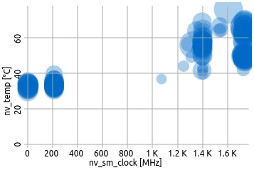
In this example, the selected metrics are accelerator clock on the X-axis and accelerator temperature on the Y-axis. Expectedly, long running, high-clock jobs accumulate in the top-right corner, while jobs with less demanding (less clocking) jobs remain cooler.
Feedback
Was this page helpful?
Glad to hear it! Please tell us how we can improve.
Sorry to hear that. Please tell us how we can improve.